

Responsive screen Designs are not just the latest trend, it is the need now❗️
Responsive design testing across devices is a primary requirement as before launching the website online, you need to test the website on different screen sizes. A variety of devices are available in the market to open web pages and designers should be fully ready for the different kinds of website responsive tests. 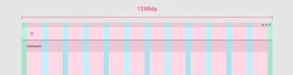


Let’s look at some responsive web design examples and study responsive web design.

A responsive layout grid is one that adapts to screen size and orientation. This ensures the consistency of the website across different layouts.
The foundation of a basic layout grid includes three components:
- Columns: Content is placed in the areas of the screen that contain columns.
- Gutters: Gutters are the spaces between columns. They help separate content.
- Margins: Margins are the space between content and the left and right edges of the screen.

Column
Column width is specified using percentages and flexibly responds to any screen size. The number of columns in the grid depends on the chosen breakpoint range. Designers can use this as a guide to ensure that content fits perfectly into its designated space.
The breakpoint range is a range of predetermined screen sizes at which a screen is displayed.
On mobile, at a breakpoint of 360dp, this layout grid uses 4 columns.

On tablet, at a breakpoint of 600dp, this layout grid uses 8 columns.

Gutter
Gutter widths are fixed units at each breakpoint range.
As to adapt with the screen, gutter width usually change at different breakpoints.
On mobile, at a breakpoint of 360dp, this layout grid uses 16dp gutters.

On tablet, at a breakpoint of 600dp, this layout grid uses 24dp gutters.

Margin
Margin widths should use fixed units for uniform consistency in layouts regardless of the device used. An adjustable margin width offers high usability for diverse interfaces by allowing for a range of different breakpoints. This approach makes it easier to change layout details during development.
On mobile, at a breakpoint of 360dp, this layout grid uses 16dp margins.

On a small tablet, at a breakpoint of 600dp, this layout grid uses 24dp margins.


🧐To understand responsive screen, open the next site example in a web browser on a desktop computer or a laptop.💻

When accessed via a mobile📱 phone, their website displays as follows.
💡Be a Pro.
You do not need to test your website on different devices every time to check your website orientation. Website developers can show you how to check the responsive website view in chrome or any web browser🖥.💻📱

If you require a simulator, responsive testing simulators are available for download. But these tools are also accessible online, making them easy to access.
Responsive web design tutorials are available on various educational websites. There you can find good examples of websites with responsive web designs. responsive web design template
☺️Want a responsive and thumb-friendly website?
For your website design or re-designing contact us.
Email at contact(at-the-rate)nexgi.com


 Start A Project
 Apply For Job
 B2B Collab
 Sale Agent
 Tech Support